CITESTE MAI MULT
Detalii
Descriere RO
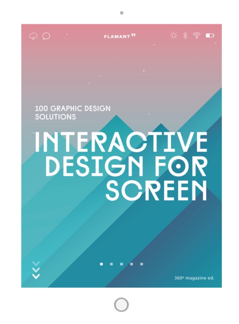
Mobile web use overtook desktop use in 2016, with the rise in the former doubling the fall in the latter. This increase in mobile traffic has made mobile user experience one of the most important factors in the success of a product or website. Providing great user experience is essential from the first second. More than 60% of users will not return to a mobile site that they had trouble accessing, and this means that content, navigation and visual design elements must be twice as intuitive as they are on a desktop. In the face of these trends, designers must constantly keep in mind the point that little screens have very little room for error. Interactive Design for Screen is the result of extensive research centred on the latest designs optimized for the screens of mobile devices. Over a hundred projects appear in this volume, and they showcase the functionality and accessibility of great mobile user interfaces. The designers featured analyse their projects from a variety of perspectives such as product specifications, site purpose and target users, making Interactive Design for Screen a highly practical and inspiring guide for students and designers who know that a great mobile user experience is nothing less than essential. It includes QR codes in each project that link to the behance page to let readers see the interactive effect of the project.
EdituraHoaki Books S.L.
Dimensiuni289 x 213 x 25
Data Publicarii01/02/2019
Format
Cartonata
Numar pagini240
Aceasta este o carte in limba engleza. Descrierea cartii (tradusa din engleza cu Google Translate) este in limba romana din motive legale.
Utilizarea web mobila a depasit utilizarea desktopului in 2016, cresterea primelor dubland scaderea in cel din urma. Aceasta crestere a traficului mobil a facut din experienta utilizatorului mobil unul dintre cei mai importanti factori ai succesului unui produs sau site web.

